Smartcard
Making the business card the top of the funnel
- Mobile
- Web
- SaaS
- Design System
- B2B
- Client
- Bitboundaire
- Year
- 2022
- Discipline
- Design & Product
- Role
- Product Designer
What I did
- Led the visual design end to end, from the card to the analytics dashboard
- Brand identity integration across colour, typography and imagery
- Design system from scratch: brand, colour, effects, typography, icons, grid, illustration
- Component library: buttons, fields, dropdowns, alerts, tables, navigation, empty states, file upload
- Material Design colour roles as the token layer, so themes swap without redrawing components
- Atomic Design component documentation, each component specced with anatomy, properties and states
- Complete mobile and web user flows, from sign-up through to the lead list
Smartcard is a digital business card with an analytics layer underneath it. You share a card; it records that the card was seen, which link was tapped, and who tapped it. Built at Bitboundaire, a near-shore studio taking US startup products from ideation to launch.
The problem
A paper business card is a dead end. It transfers information in one direction and reports nothing back. You hand out fifty at a conference and learn nothing about which fifty, or which of them ever looked at it again.
Meanwhile the company has the same problem one level up: it cannot see which of its people are actually generating contacts, or what any of that is worth.
What I did
The design reframed the card as the top of a funnel rather than a credential, and everything followed from that.
The account is a company, not a person. A business signs up, not an individual: it gets its own white-label branding and registers the employees who each get a card. Every employee’s leads roll up into one place, so a manager sees the whole team’s activity rather than piecing it together from whoever remembers to report.
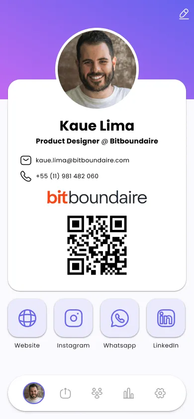
The card is the product surface. Photo, name, title, contact details, company mark, a QR code and a row of link buttons: website, Instagram, WhatsApp, LinkedIn. It is the thing shared, so it carries the brand and stays uncluttered. Sharing itself works two ways: scan the QR code, or tap a physical NFC card bound to the same profile during onboarding, so the “smartcard” is a real object as often as it is a screen.
Every interaction is an event. Card visits, link clicks and captured contacts are counted separately, because they are three different depths of interest and collapsing them into one number destroys the signal.
Contacts become leads with a value attached. The dashboard states the lead count, and next to it a potential value derived from an average per lead. It worked less as a report than as a call to action: a number a manager could point to and ask for more of, rather than a count nobody quite knew what to do with.
Comparison is deliberate. A leaderboard ranks a person against the rest of their company. It did what it was built to do: management used it to keep an eye on who was generating leads, and it turned lead generation into something employees actively competed over, wanting to be seen at the top rather than just quietly reporting numbers.
Two surfaces, one system. Mobile is for sharing and glanceable stats; web is for the full lead list, filtering and admin. Both are built from one component library so they stay the same product.
The design system
Smartcard’s system was built from scratch rather than adapted, and it is the part of the project with the longest life.
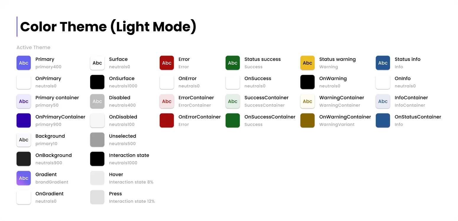
Colour uses Material Design roles: primary, container, surface, error and
their on pairs, plus interaction, hover and press states. The token layer
carries meaning, so components never hard-code a hex. Components are documented
in Atomic Design terms, each with anatomy, properties and states: the button
spec alone covers label grammar, width behaviour, four states, icon slots and
loading.
That specificity is what made the handoff cheap. A component with documented properties is a conversation that does not need to happen twice.
Outcome
Smartcard launched with strong momentum, and the reception backed up the design bets: the leaderboard turned lead generation into something employees competed over, and the value-per-lead figure worked as intended, giving managers a number to act on instead of a raw count. Every team that got its hands on the product used it, and used it the way it was designed to be used.
The project was shut down a few months after launch, following a change in leadership at the owner company, not a product or adoption problem. That cut the window short before any longer-term usage data could accumulate, but within that window the response was consistently positive.